About Me
Sepideh Mehraban
UX Designer · Copenhagen 2200 · INFJ-T
I am a UX designer who loves solving problems and creating easy, delightful experiences for people. I love the process of turning an idea into a product that makes people smile.
My personality type means I love making a positive impact on the world — which is why I enjoy working directly with users. I care deeply about the people I design for.
Before UX, I worked as a customer service specialist — acting as a link between businesses and customers. That experience taught me a lesson I carry into every project: always focus on what users actually need, not on assumptions. It also sharpened my ability to listen closely, understand complex needs, and solve problems under pressure.
While I enjoy every part of UX, I am most passionate about interaction design and information architecture. When I'm not designing, I like reading novels, writing short stories, and listening to podcasts — so if you're looking for me, you may find me there.
Thanks for stopping by! Feel free to connect with me:
Background Overview
Parfums Christian Dior
Supply Chain & Customer Service Assistant
Hafez Tile & Ceramic Co
Supply Chain Analyst
Roskilde University
MSc Business Administration & Leadership
ReDI School Copenhagen
UX Design Program
NexaLand
UX Design System Project
Shomal University
BSc Business Administration
My background blends business strategy, systems thinking, and real-world problem-solving. Studying business taught me how to align design with organisational goals, while my supply chain and customer service roles strengthened my empathy, attention to detail, and understanding of how operational pain points affect people.
My UX training then helped me translate these insights into human-centred design decisions that balance user needs with business efficiency.
Let's Connect
Based in Copenhagen. Open to full-time UX/UI positions, internships, and freelance projects.
I bring business thinking, user empathy, and a thorough design process.
Copenhagen, Denmark · LinkedIn
UX / UI Designer
A problem-solving character who loves humans and wants to make them smile.
Case Study 01
Vera (as a UX | UI Designer)
Case Study 02
YouSee (as a UX Designer)
Case Study · YouSee
Redesigning the billing experience in Mit YouSee.
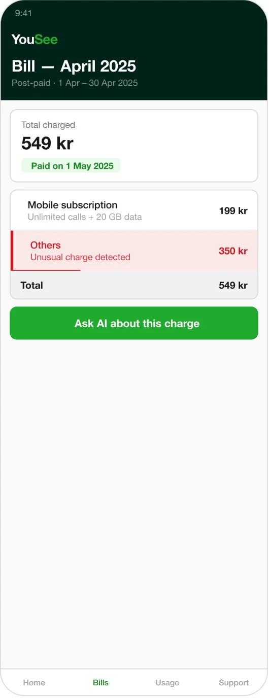
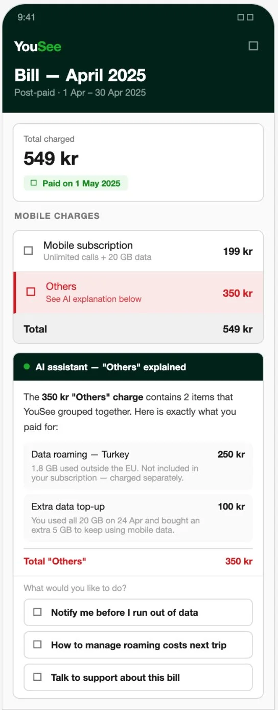
YouSee's customer support was overwhelmed with billing-related calls. I redesigned the in-app billing experience using AI to help users understand their charges without needing to contact support.
Duration
5 Weeks
Team
Solo project
Role
End‑to‑End UX
Tools
Figma · Google Forms · Claude
YouSee, a major Danish telecom provider, was receiving a high volume of customer support calls. They challenged us to redesign the Mit YouSee app using AI-powered self-service to reduce call volume and help users resolve issues on their own.
Research shows that: User Pain Points
Unclear billing explanation
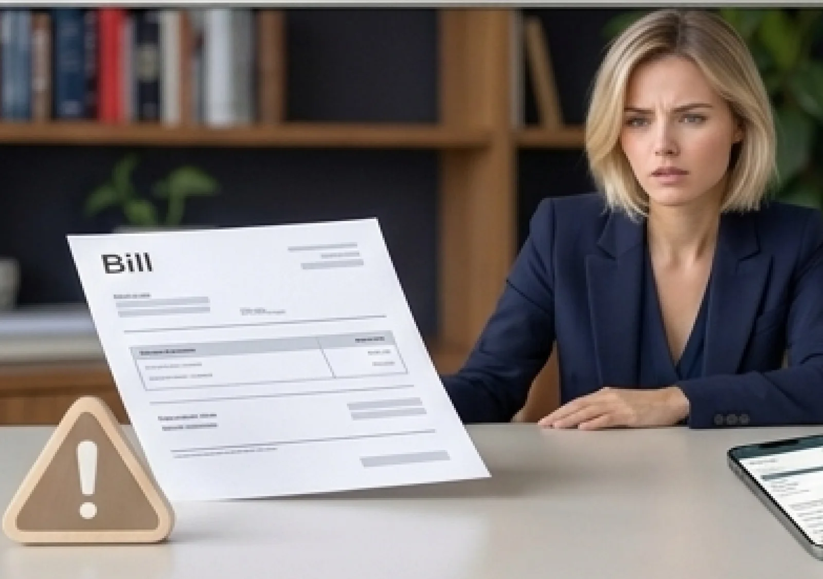
Users don't understand extra charges → confusion → loss of trust
Generic digital support
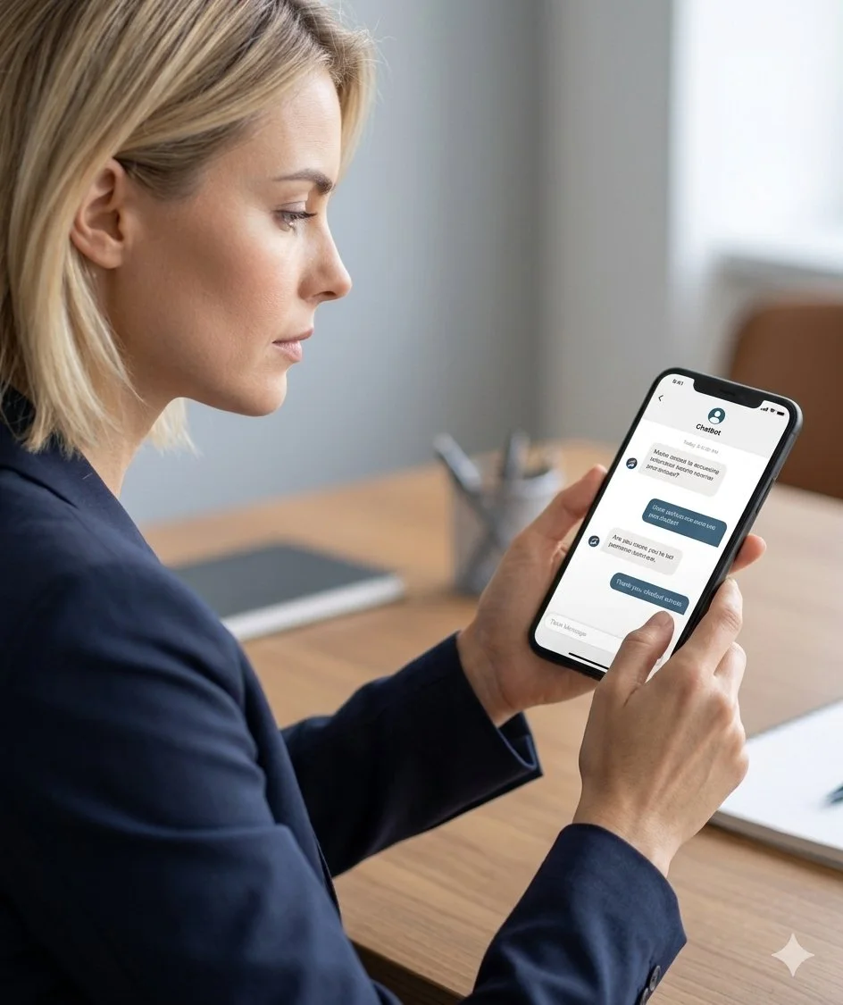
Chatbots give repetitive, irrelevant answers → frustration → low confidence
Unreachable human support
Long waiting times → users give up → negative brand perception
Project Goals
1. Clarity
Transparent billing details
Clear language
Visual hierarchy
2. Trust
Personalized AI explanations
Empathetic tone
3. Confidence
Proactive notifications
Self-service options
My 5-week design sprint consisted of 4 phases:
Note: there is no doubt that iteration is necessary during all phases
← swipe to see full diagram
01
Research
Deliverables
02
Planning
Deliverables
03
Design
Deliverables
04
Testing
Deliverables
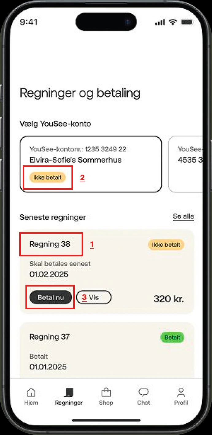
Before conducting user interviews, I performed a heuristic evaluation of the Mit YouSee app to identify the main usability issues and gain a better understanding of what to focus on during user research.
The website's design and content were outdated, and I noticed several usability problems that affected clarity and transparency.
| # | Step | Focus | Heuristic & finding | What can I do? |
|---|---|---|---|---|
| 1 | Identify the flow | The "Regning 38" label with no context | Match between system and real world — uses internal numbering like "Regning 38" instead of showing the billing period or total amount upfront. | Replace bill numbers with clear billing periods and show the total amount directly on the card. |
| 2 | Evaluate feedback | The "Ikke betalt" badge | Visibility of system status — says "not paid" but gives no amount, no due date context, and no breakdown of what the bill contains. | Show the amount owed and a brief summary of charges next to the status badge. |
| 3 | Check error prevention | "Betal nu" and "Vis" buttons | Error prevention — "Betal nu" (pay now) is prominent, but users can pay without understanding the charges. No "Explain this charge" option exists. | Add an "Explain this charge" button that triggers an AI assistant to break down the bill before payment. |
| 4 | Assess help | No in-context help or AI explanation | Help and documentation — there is no contextual help on the billing page. The only option is to leave and contact support. | Integrate an AI assistant directly on the billing page that reads the user's data and explains charges in plain language. |
22 respondents · Mobile operator users in Denmark · Pre-interview survey
I created this survey to validate my assumptions about user frustrations and behaviors before starting interviews.
My goal was to understand how people actually interact with their mobile operator's app and what triggers their need for support.
Question 1
What do you most often use your mobile operator's app for?
Multiple answers allowed · 22 respondents
How it helped me
When I saw that billing and data usage were the top actions, it confirmed that billing clarity should be a core focus in my redesign.
Question 2
Have you ever contacted your mobile operator's customer support?
22 respondents
Yes · 18
No · 4
How it helped me
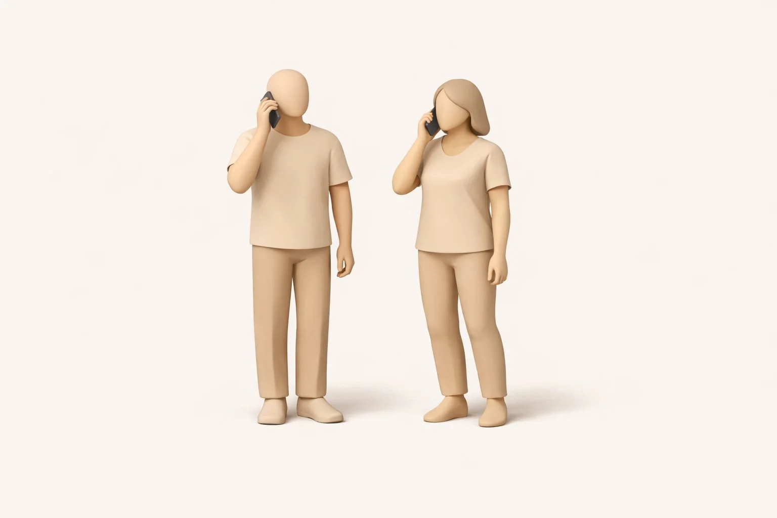
The fact that 82% had contacted support showed me that support frustrations are widespread — which later informed the "Generic Chatbot" and "Long Wait" visuals.
Question 3
What was the main reason you contacted support?
Of the 18 who contacted support
How it helped me
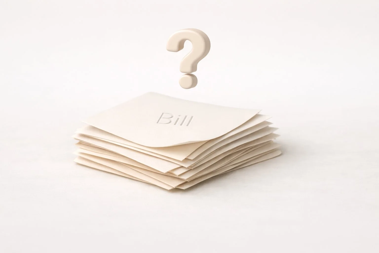
When 50% said billing issues, it validated my decision to create the "Confusing Bill" visual and focus on simplifying invoices.
Question 4
How was your experience with the support?
Of the 18 who contacted support
How it helped me
Seeing that 77% had a negative experience helped me shape the emotional tone of the project — frustration, waiting, and lack of clarity.
Question 5
Would you trust an AI assistant in the app to help with your issue?
22 respondents
How it helped me
The 73% openness to AI gave me confidence to design an AI billing assistant as a realistic and desirable solution.
I wanted to understand different types of user behaviour, so I interviewed:
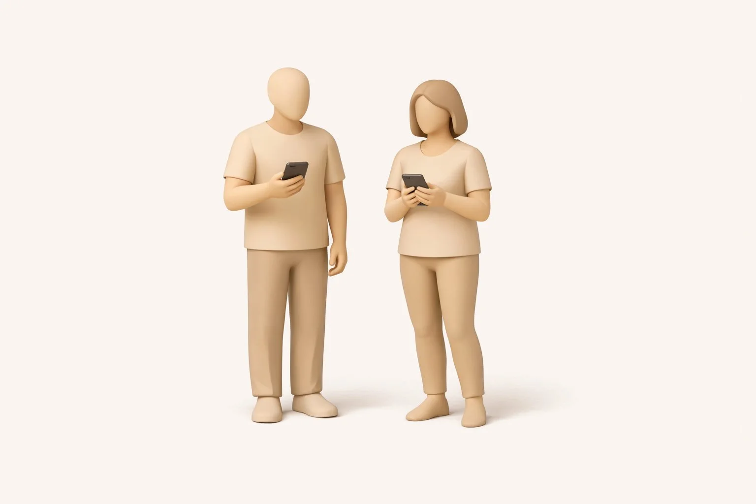
Mobile-service users
3 peoplePeople who prefer calling
2 peopleRather than sticking to strict, predefined questions, I let the discussions flow so participants could share their real experiences and frustrations.
From this research, I gained a clearer understanding of what users value in a mobile operator — the elements that make the service feel trustworthy, transparent, and effortless to use.
So I identified four elements that users value the most — and I reflected these directly in the Bill page and the AI support flow, where the pain actually happens.
Clear billing
Helps users understand charges and avoid confusion
Self-service tools
Allow users to solve issues independently without calling support
Fast support response
Reduces waiting frustration and builds trust
Transparency
Communicates honesty and reliability in every interaction
I analyzed 4 Danish mobile operators' apps, examining their billing features, support channels, and AI capabilities. This helped me identify a clear gap in the market and confirm which features would meaningfully differentiate the Mit YouSee experience.
| Feature | Telenor | Telia | 3 (Tre) | CBB |
|---|---|---|---|---|
| Bill breakdown | Itemised by service, moderate clarity | Grouped by category, moderate detail | Basic summary, limited detail | Simple and clear — few services, few charges |
| AI chatbot | Rule-based bot, no account data access | FAQ-based bot, no personalization | Basic chatbot, redirects to phone support | No chatbot — email/web form only |
| Billing explanation | None | None | None | None |
| Self-service billing | View & pay only | View & pay only | View & pay only | View & pay only |
| Proactive notifications | Usage alerts + payment reminders | Usage alerts + payment | Payment reminders only | Minimal |
"No Danish mobile operator offers an AI assistant that can read the user's personal billing data, explain specific charges, and escalate to human support — all within one seamless in-app flow."
No operator explains billing
Every app lets you view and pay — but none help you understand what you're paying for. This is the gap my design fills.
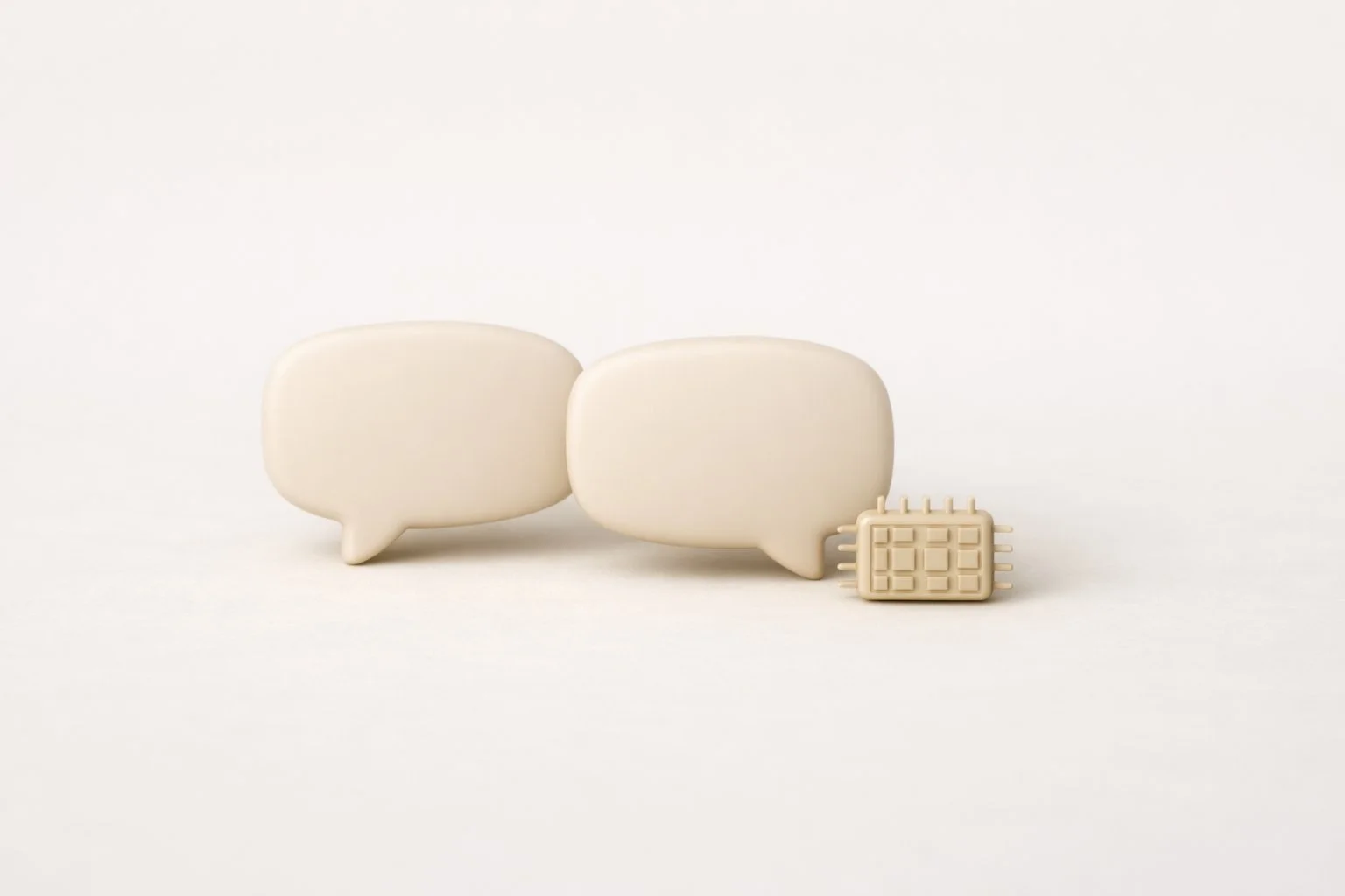
AI chatbots are generic everywhere
No Danish operator uses AI that can read your personal account data and give specific answers. My design introduces a context-aware AI assistant.
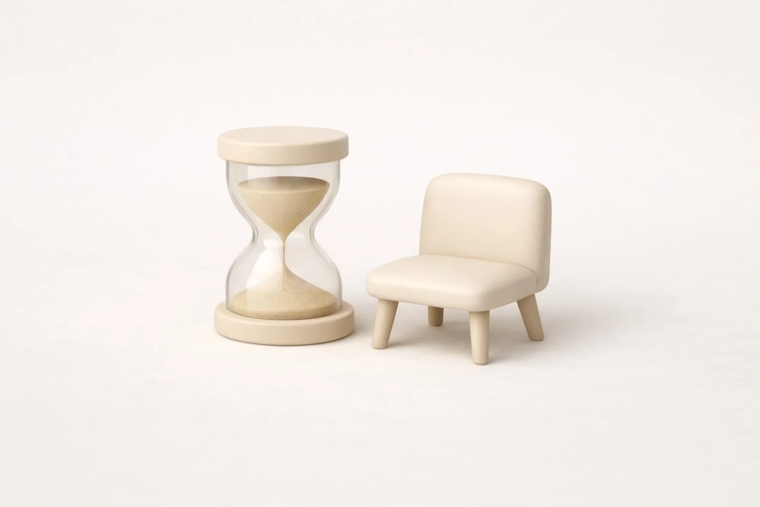
Support still means waiting
Even operators with decent apps force users to call or wait for chat. My design keeps users in the app with AI + human escalation built in.

After reviewing all my research, I identified the key challenges and shaped my design decisions around solving them.
Based on the insights I gathered, I developed a persona to guide my design decisions and keep the user's goals and frustrations at the center of the process.
Persona
Anna Madsen
34 years old · Office worker · Copenhagen
Situation
Anna is a 34-year-old office worker living in Copenhagen. She manages her mobile and internet subscriptions herself and prefers solving problems digitally — as long as the tools actually work. She values clarity, transparency, and quick solutions because she doesn't have time to sit in support queues.

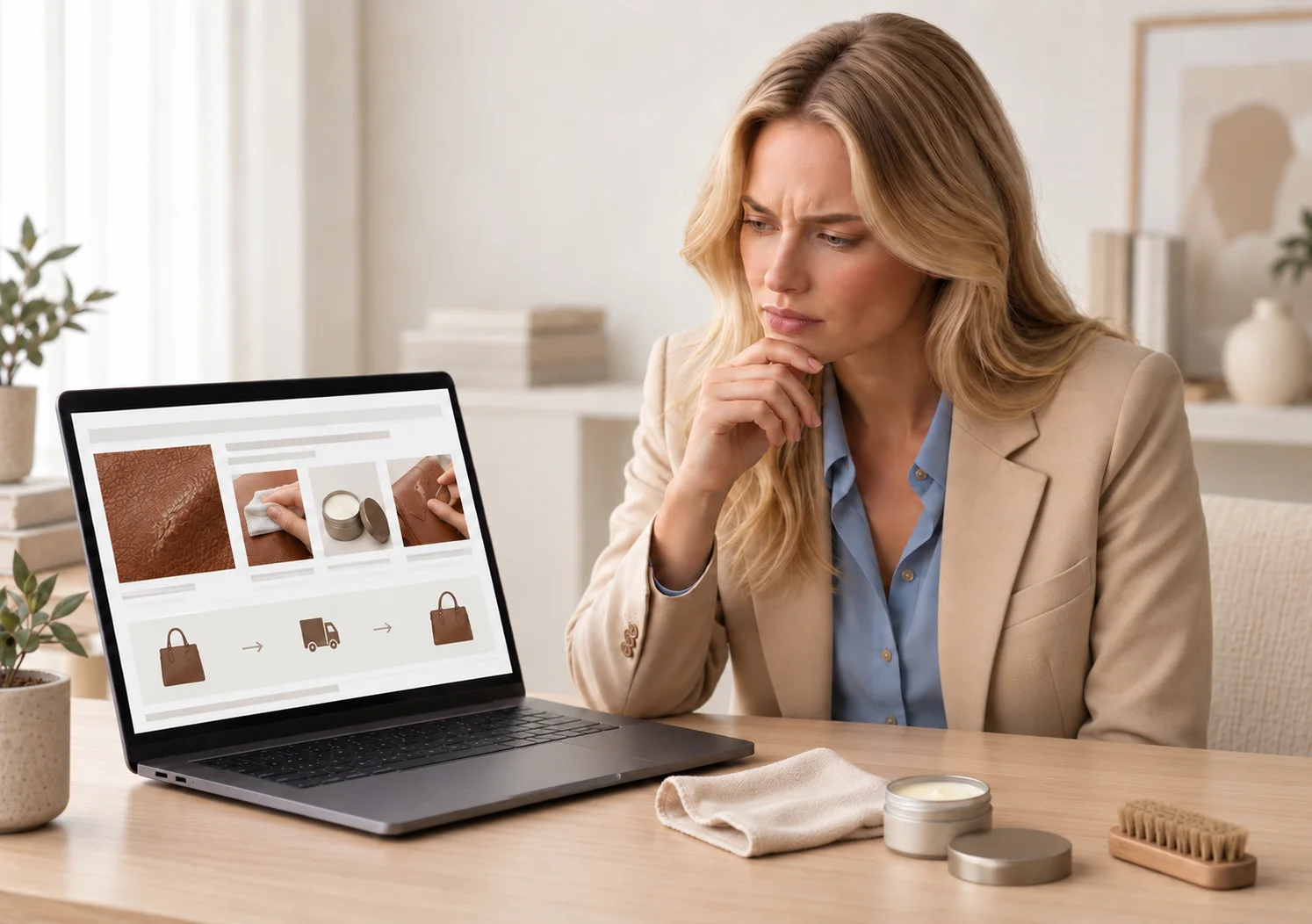
Goals
Understand her bills clearly without needing to call support
Solve issues quickly through digital tools
Get explanations that are specific to her situation
Avoid long wait times or visiting physical stores
Feel confident that the information she receives is correct
Frustrations
Unexpected charges with no explanation ("others")
Chatbots that give generic answers
Customer support queues that take an hour with no response
Being sent back and forth between chatbot → phone → store
Digital tools that cannot handle personal or unique cases
Feeling like the system doesn't understand her situation
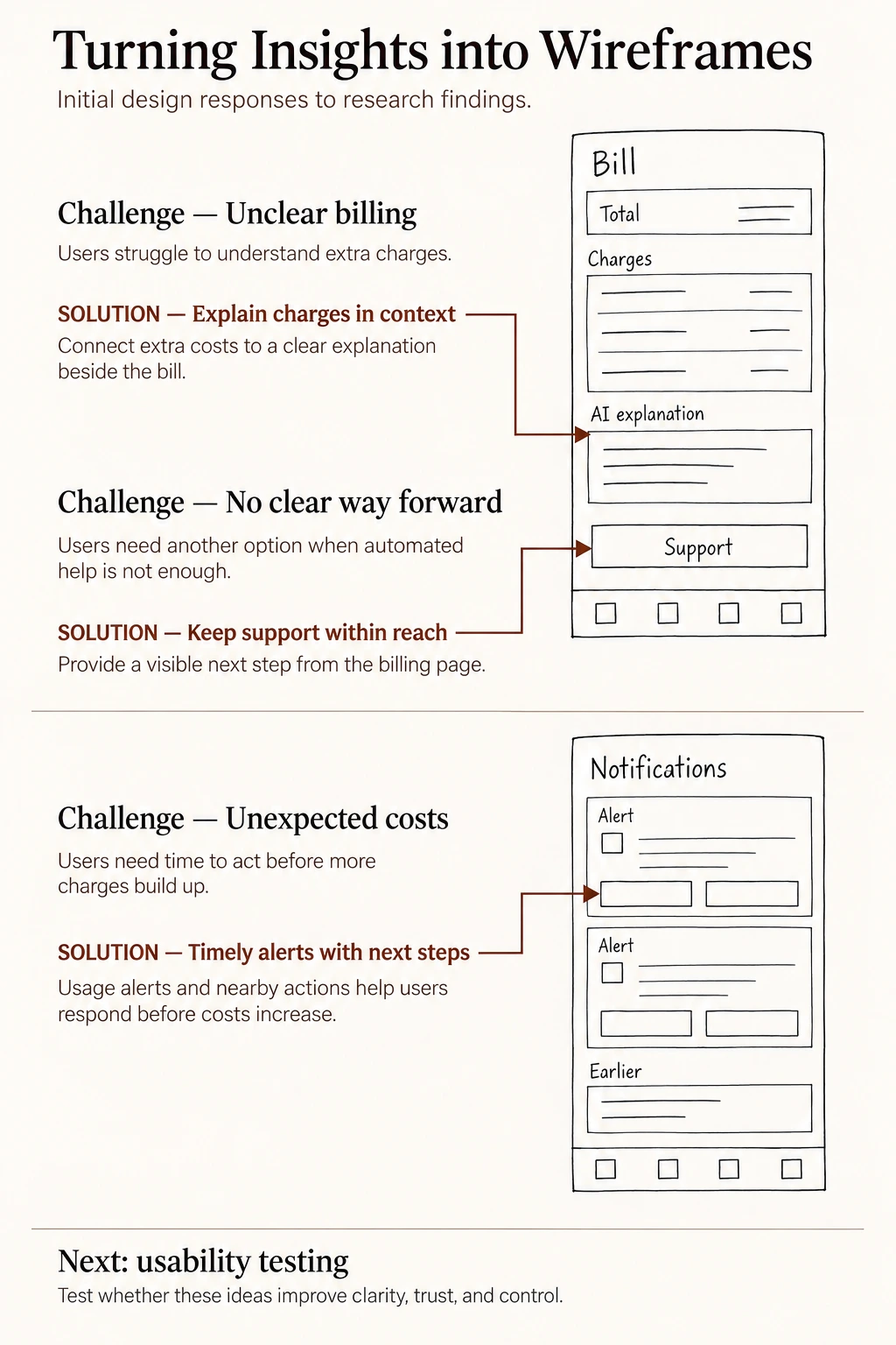
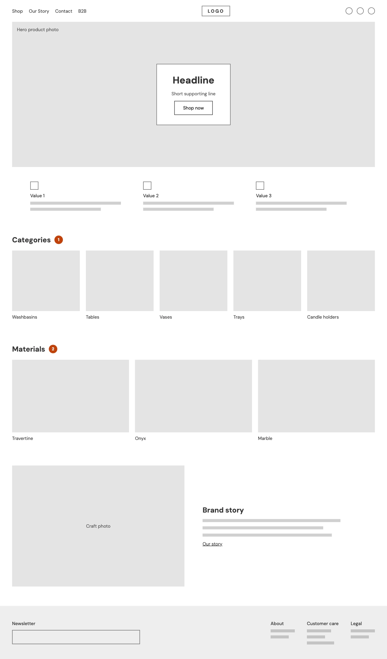
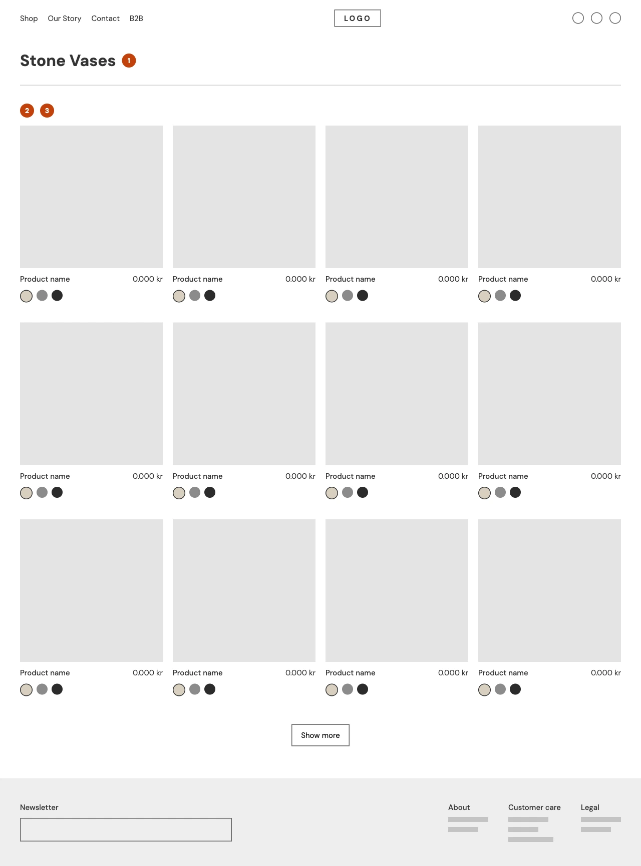
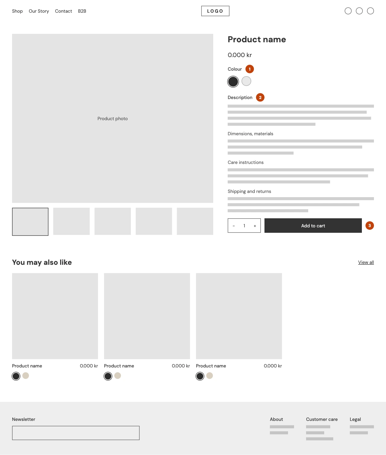
I created low‑fidelity wireframes to outline the page layouts and shape the overall design direction.
Bill page
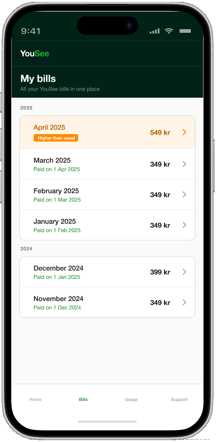
Redesigned billing layout with clear breakdown and action options
AI chat assistant
Conversational AI interface with consent, data reading, and support escalation
I tested two early design directions to understand how users emotionally responded to AI assistance in a billing context. Both iterations were rejected — not because of functionality, but because of tone.
| Observation | The red color triggered anxiety and made users feel something was wrong. |
| Insight | Alert-style visuals created negative emotions even when help was offered. |
| Decision | Did not proceed. The design failed to convey reassurance and a calm tone. |
| Observation | Users felt confused when the AI explained charges without being asked. |
| Insight | Automatic assistance reduced trust because it broke the sense of control — users wanted to initiate help themselves. |
| Decision | Did not proceed. The AI felt intrusive instead of supportive. |
In this section, you can check out the complete final prototype.
View Mobile Figma Prototype| Insight | What This Taught Me |
|---|---|
| Clarity builds trust | Users stay calm when information is simple, structured, and human. |
| AI needs transparency | People want to know what AI reads and why before they accept help. |
| Emotions matter | Billing confusion is emotional — tone and pacing change the whole experience. |
| Small UI choices reduce stress | Tags, icons, and short blocks make complex info feel manageable. |
| Users want control | Giving options (AI, human support, next steps) increases confidence. |
| Next Step | Why It Matters |
|---|---|
| Test with more users | Validate if the explanation flow reduces anxiety across different personas. |
| Refine the consent step | Explore lighter, faster ways to communicate data transparency. |
| Expand to other billing issues | Apply the same clarity model to disputes, refunds, and plan changes. |
Case Study · Vera Leather
a leather nordic luxury brand website.
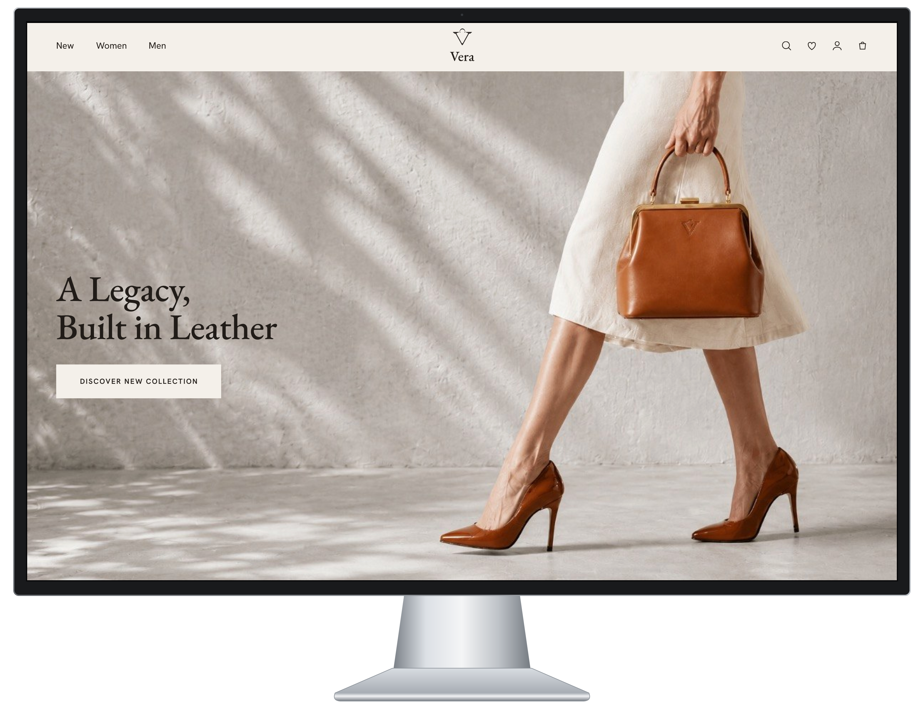
I created Vera, a Nordic-inspired luxury brand, to explore how clarity and simplicity work together to create a more trustworthy shopping experience.
Duration
2 Months
Team
Solo project
Role
End‑to‑End UX
Tools
Figma · Zoom · Canva · Balsamiq · Maze · Claude · Gemini · Copilot
Early research outlined a stakeholder aiming for a clean, premium experience where clarity and simplicity guide every interaction.
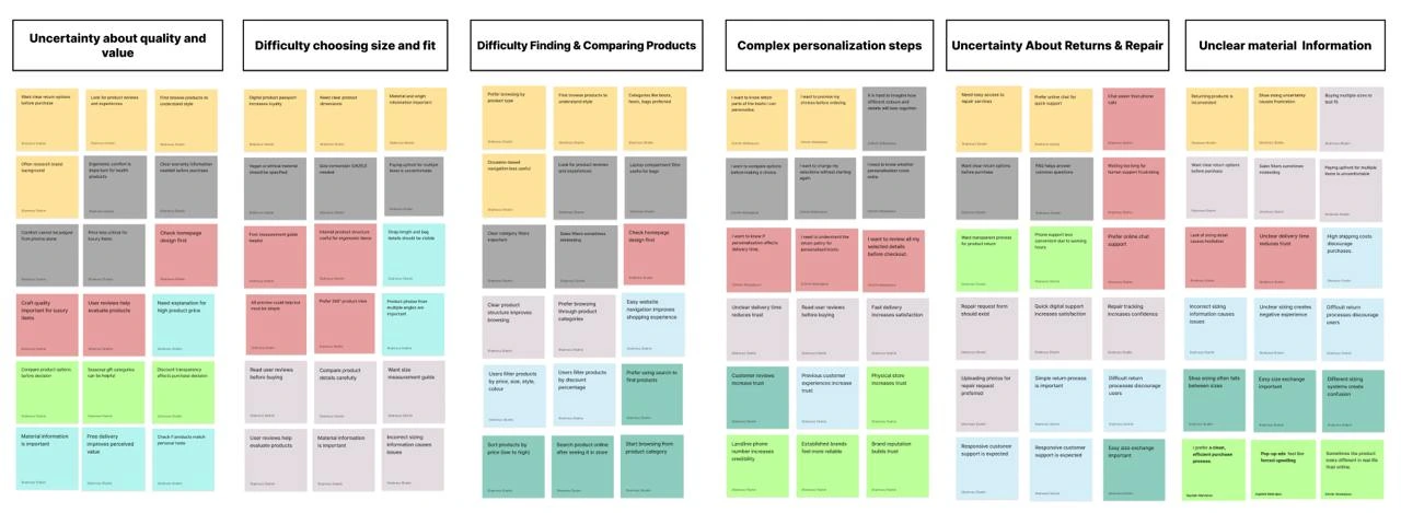
Research shows that: User Pain Points
Unclear product representation
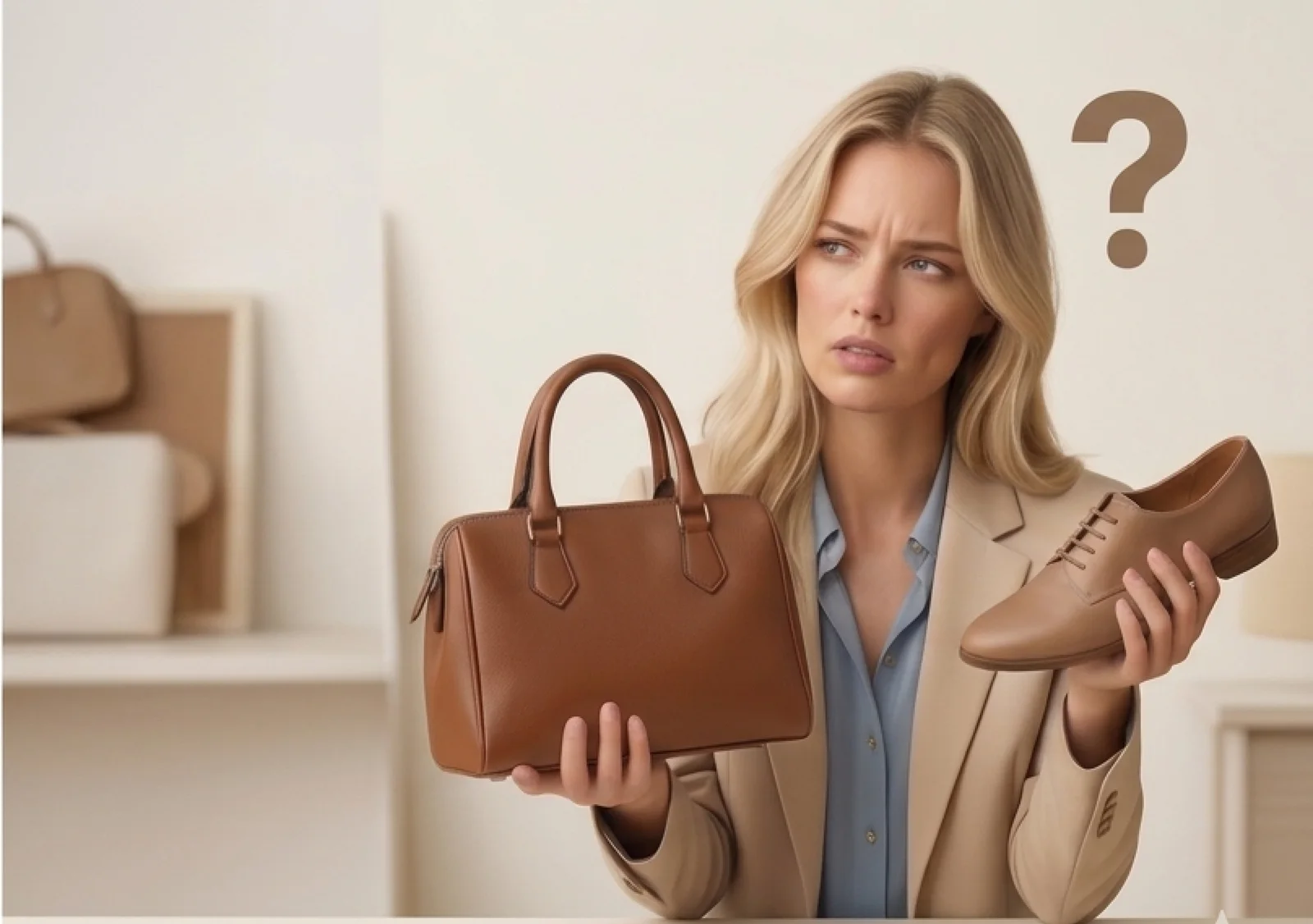
Users can't trust the photos → uncertainty → hesitation to buy
No help with styling or matching
Users don't know what goes with what → long browsing time → frustration
Repair information is hidden or confusing
Users don't know how to fix or maintain items → low post‑purchase confidence
1. Clarity
Faster browsing
Accurate visuals
Clear product info
2. Guidance
Matching suggestions
Personalization steps
3. Confidence
Repair info
Transparent options
My 2 months design sprint consisted of 4 phases:
Note: there is no doubt that iteration is necessary during all phases
← swipe to see full diagram
→ Deliver
01
Research
Deliverables
02
Planning
Deliverables
03
Design
Deliverables
04
Testing
Deliverables
My first step in solving the problem was to research what makes fashion feel luxurious and to understand my target users' needs.
The study began with two phases:
User interviews to learn from different types of shoppers.
Competitive analysis to see how other brands approach similar challenges.
I wanted to figure out the following:
How to understand and respond to the needs of luxury‑fashion enthusiasts.
How to help them build a long‑lasting relationship with the brand.
so I interviewed:
Luxury‑fashion enthusiasts
12 peoplePeople who believe spending a lot on luxury brands is unnecessary
6 peopleI asked more open-ended questions, allowing for a discussion with the interviewees rather than a straightforward question-and-answer format.
According to my interviews, my target users value several elements that make a brand feel premium and trustworthy. "Vera" reflects four of these elements, which I highlight on the homepage so users can notice them immediately and understand how the brand stands out.
Repair promise — communicates long‑term care and responsibility
Free returns and exchanges — builds trust and reduces purchase anxiety
Personalization — allows users to create a product that feels unique and meaningful
Simplicity — creates a calm, elegant, and easy shopping experience
I analyzed 13 competitor websites, examining their features, visual language, and user flows. This helped me design a clearer information architecture and identify which features would meaningfully differentiate Vera in the luxury market.
| Feature | Berluti | Loewe | MOYNAT | FENDI | CELINE | Loro Piana | HERMÈS | Mulberry | BOTTEGA VENETA | TOTEME | GUCCI | LOUIS VUITTON | BURBERRY |
|---|---|---|---|---|---|---|---|---|---|---|---|---|---|
| Gifts | ✓ | ✓ | ✗ | ✓ | ✓ | ✗ | ✗ | ✗ | ✓ | ✓ | ✓ | ✓ | ✓ |
| New Arrival | ✓ | ✗ | ✗ | ✓ | ✓ | ✗ | ✗ | ✗ | ✓ | ✓ | ✓ | ✓ | ✓ |
| User's Profile On Top Right | ✓ | ✓ | ✗ | ✗ | ✗ | ✓ | ✓ | ✓ | ✓ | ✓ | ✓ | ✓ | ✓ |
| Bags As A Separate Category | ✗ | ✗ | ✗ | ✓ | ✗ | ✗ | ✓ | ✓ | ✓ | ✗ | ✓ | ✓ | ✓ |
| Wishlist on Top | ✓ | ✓ | ✗ | ✓ | ✗ | ✓ | ✗ | ✓ | ✗ | ✓ | ✗ | ✓ | ✗ |
| Search On Top | ✓ | ✓ | ✓ | ✓ | ✓ | ✓ | ✓ | ✓ | ✓ | ✓ | ✓ | ✓ | ✓ |
| Shopping Bag | ✓ | ✓ | ✗ | ✓ | ✗ | ✓ | ✓ | ✓ | ✓ | ✓ | ✓ | ✓ | ✗ |
| Breadcrumbs | ✗ | ✓ | ✗ | ✓ | ✗ | ✗ | ✗ | ✓ | ✓ | ✓ | ✗ | ✗ | ✓ |
| Advanced Product Filtering | ✓ | ✓ | ✗ | ✓ | ✓ | ✓ | ✓ | ✓ | ✓ | ✓ | ✓ | ✓ | ✓ |
| Top Menu | ✓ | ✓ | ✗ | ✗ | ✗ | ✓ | ✓ | ✓ | ✓ | ✓ | ✗ | ✗ | ✓ |
| The "Ghost" Navigation | ✗ | ✗ | ✓ | ✓ | ✗ | ✗ | ✗ | ✗ | ✗ | ✗ | ✓ | ✓ | ✗ |
| Sale | ✗ | ✗ | ✗ | ✗ | ✗ | ✗ | ✗ | ✓ | ✗ | ✗ | ✗ | ✗ | ✗ |
| First Page Price | ✓ | ✗ | ✗ | ✗ | ✗ | ✗ | ✗ | ✓ | ✗ | ✗ | ✗ | ✓ | ✗ |
| The "Reveal" Effect | ✓ | ✗ | ✗ | ✗ | ✗ | ✗ | ✗ | ✗ | ✗ | ✗ | ✗ | ✗ | ✗ |
| Recommendation System | ✓ | ✓ | ✗ | ✓ | ✗ | ✓ | ✓ | ✓ | ✓ | ✓ | ✓ | ✓ | ✓ |
| Mobile App | ✗ | ✗ | ✗ | ✗ | ✗ | ✗ | ✗ | ✗ | ✓ | ✗ | ✓ | ✓ | ✓ |
| Review | ✗ | ✗ | ✗ | ✗ | ✗ | ✗ | ✗ | ✓ | ✗ | ✗ | ✗ | ✗ | ✗ |
| Book An Appointment | ✓ | ✓ | ✓ | ✓ | ✓ | ✓ | ✓ | ✓ | ✓ | ✗ | ✓ | ✓ | ✓ |
| Book a Repair | ✗ | ✗ | ✗ | ✗ | ✗ | ✗ | ✓ | ✓ | ✗ | ✗ | ✗ | ✗ | ✗ |
| Black Font | ✗ | ✓ | ✗ | ✓ | ✓ | ✓ | ✓ | ✓ | ✓ | ✓ | ✗ | ✗ | ✓ |
| Clickability of Hero Image | ✓ | ✓ | ✓ | ✓ | ✓ | ✗ | ✓ | ✓ | ✓ | ✓ | ✓ | ✓ | ✓ |
Key Insight
Only Vera combines advanced personalization, a repair promise, and a digital care profile. No competitor offers all three together.
Functional Foundation
My research shows that standard features are common across all major luxury brands. While these are necessary for a functional website, they do not inherently make the experience feel "luxurious" on their own.
Emotional Differentiation
Vera stands out by prioritizing emotional connection with the user.
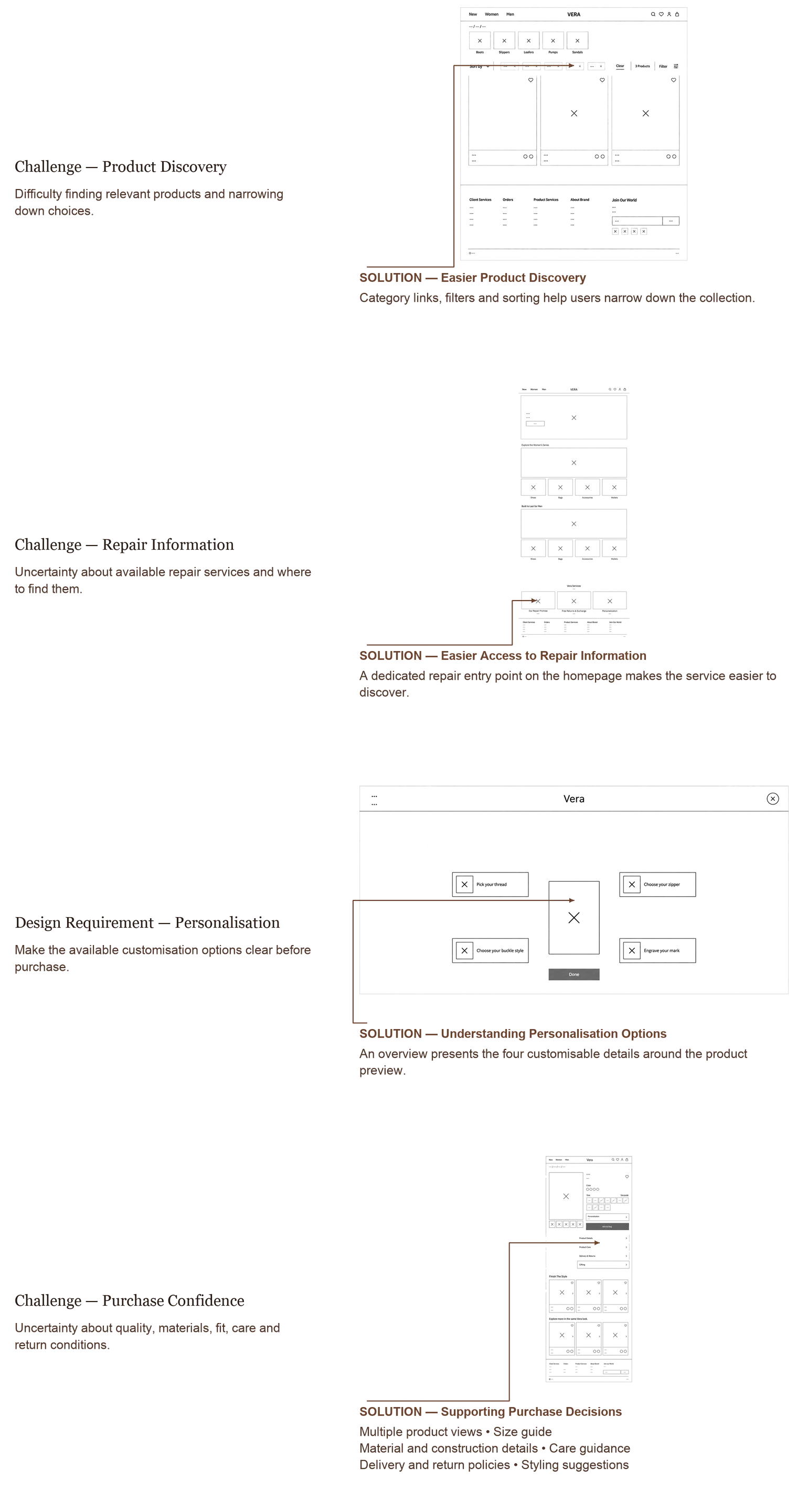
After analyzing all of my research, I began to understand my project's challenges and tried to find a solution in my design.
Challenge
Vera's Approach
Luxury is not about price — it is about perception, experience, and emotional value.
Focus storytelling and craftsmanship instead of price
Luxury is not just the product — it is the lifestyle around it.
Reflect lifestyle and identity through imagery and tone
Luxury includes care and responsibility — without implying poor quality.
Highlight repair promise to build long‑term trust
Luxury is about rarity and personal expression.
Personalization flow for uniqueness
Luxury is about transparency and honesty.
Show product details beside each item
Luxury is about harmony and curated taste.
Recommend complementary items for refined style
To define clear design tasks and stay focused on the users' needs throughout the project, I developed a persona based on the insights I gathered during my research. The persona helped me translate my findings into a concrete representation of the user's goals, and frustrations.
Archetype
Quality-Driven Minimalist
User Persona
"I don't want a closet full of things; I want a few pieces that are made perfectly and look effortless."
Kristina is a 32-year-old creative project manager in Copenhagen who values "quiet luxury." She invests in timeless, high-quality pieces that reflect her refined taste and professional confidence.
Goals & Frustrations
User Storyboard
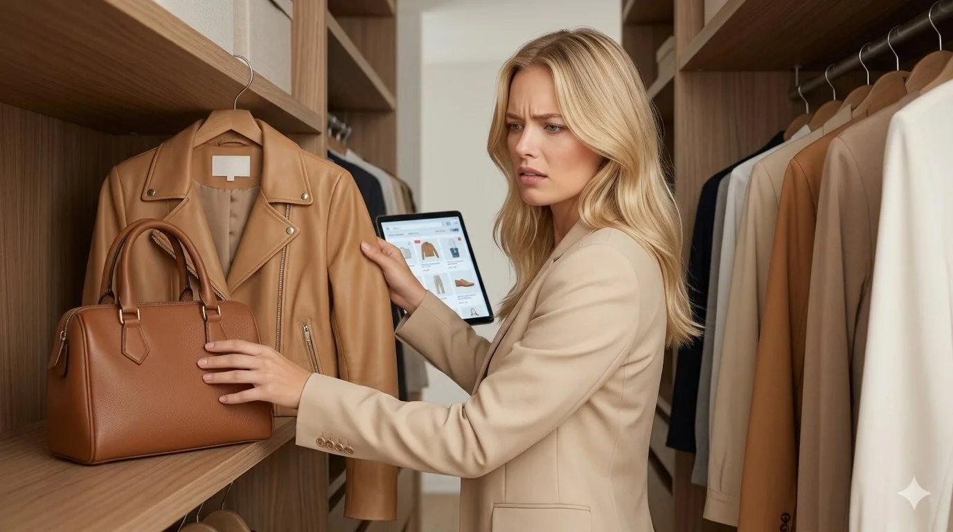
01. The Need: Searching for Uniqueness
Kristina is at home, looking at her wardrobe. She values "quiet luxury" and wants a high-quality leather piece that feels truly hers.
Standard online stores feel cluttered and mass-produced. She seeks a connection that most digital experiences fail to provide.
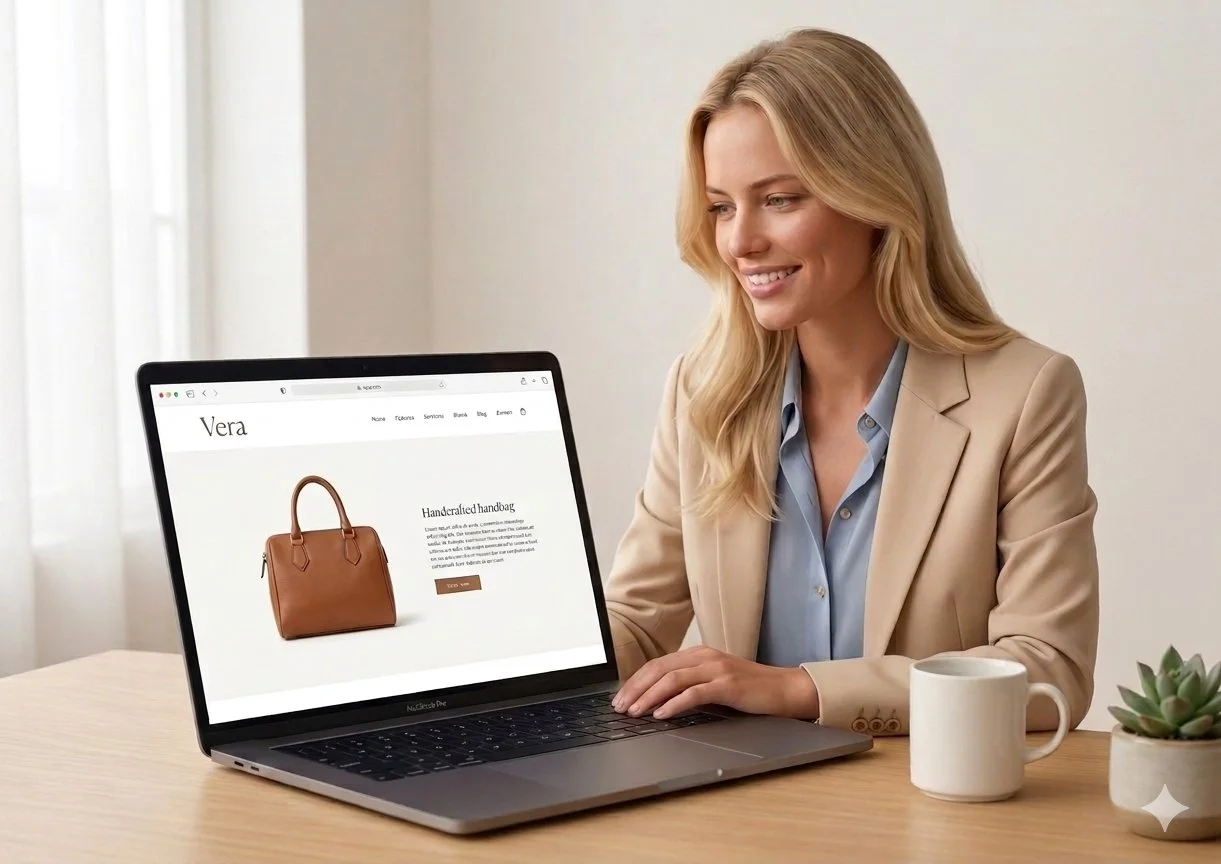
Emotion: Frustrated & Bored02. Discovery: First Impressions on Laptop
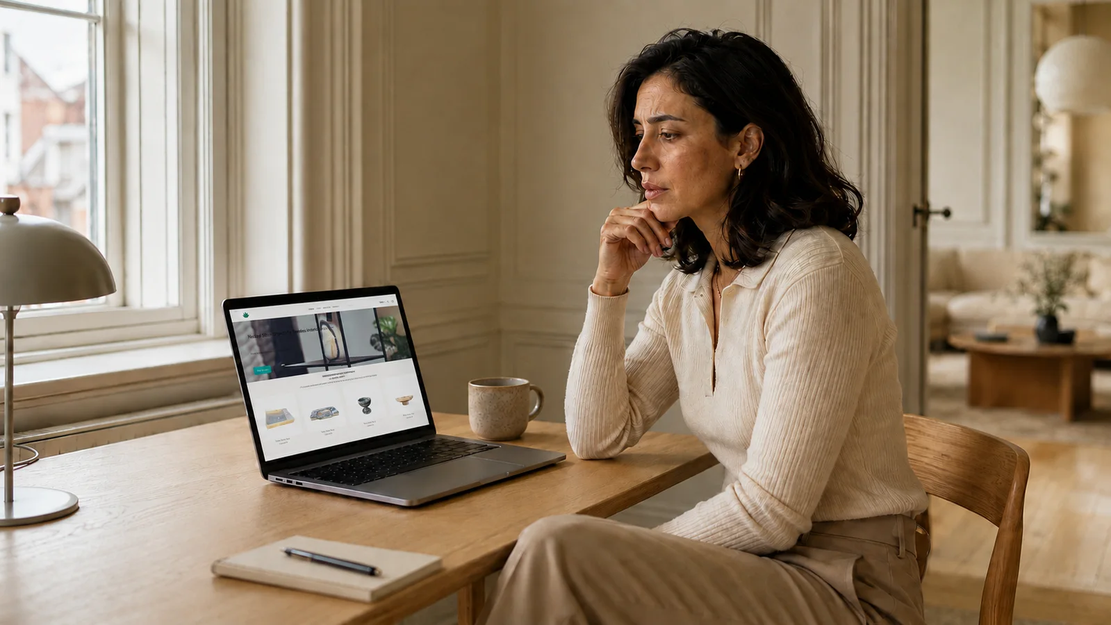
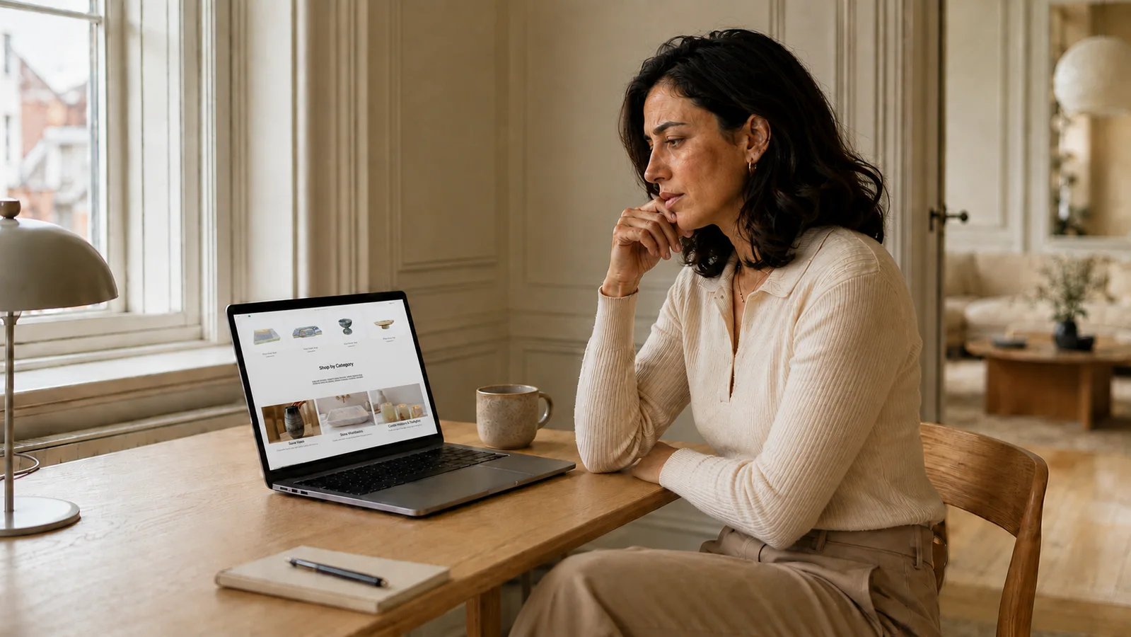
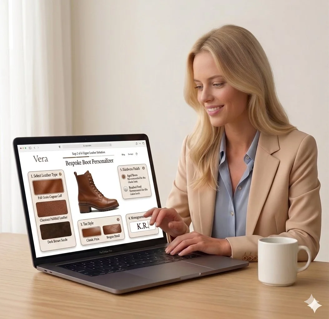
Kristina opens the Vera website on her laptop. The large screen allows the high-fidelity imagery to stand out.
She is immediately struck by the generous white space and the clean, intuitive layout. The stress of cluttered browsing vanishes.
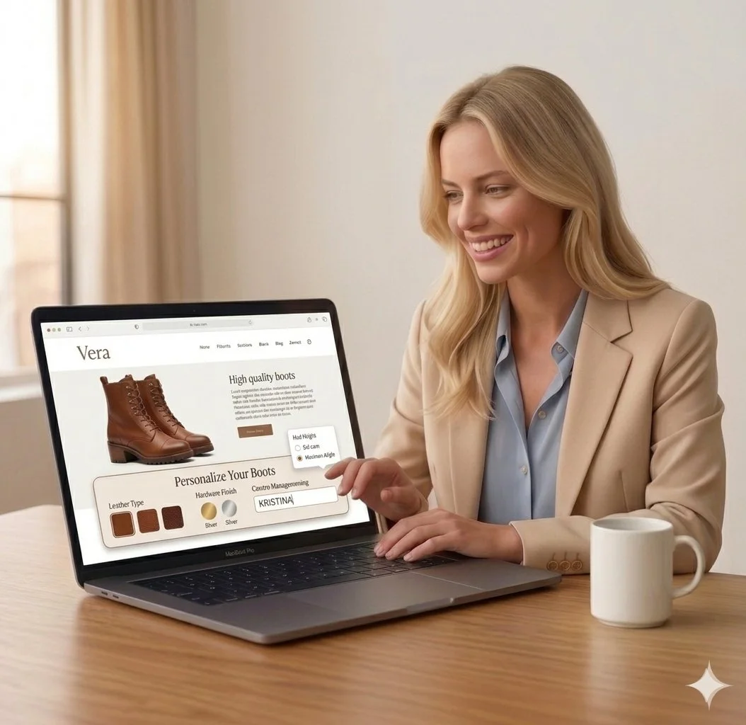
Emotion: Interested & Calm03. Interaction: Discovering Personalisation
Kristina finds boots that resonate with her style. She notices a "Personalize" feature that allows her to make them uniquely hers.
Emotion: Empowered04. Interaction: Customising the Product
The customization flow is minimal and user-friendly. She feels a sense of trust in the brand's clear and premium guidance.
Emotion: Confident & Trusting05. The Result: A Piece Just For Kristina
Kristina completes her purchase on her laptop. She isn't just buying another boot; she has created a personalized extension of herself.
The seamless experience has built lasting trust. She closes her laptop feeling satisfied and loyal to the Vera brand.
Emotion: Satisfied & LoyalKristina's Boot Purchase Journey
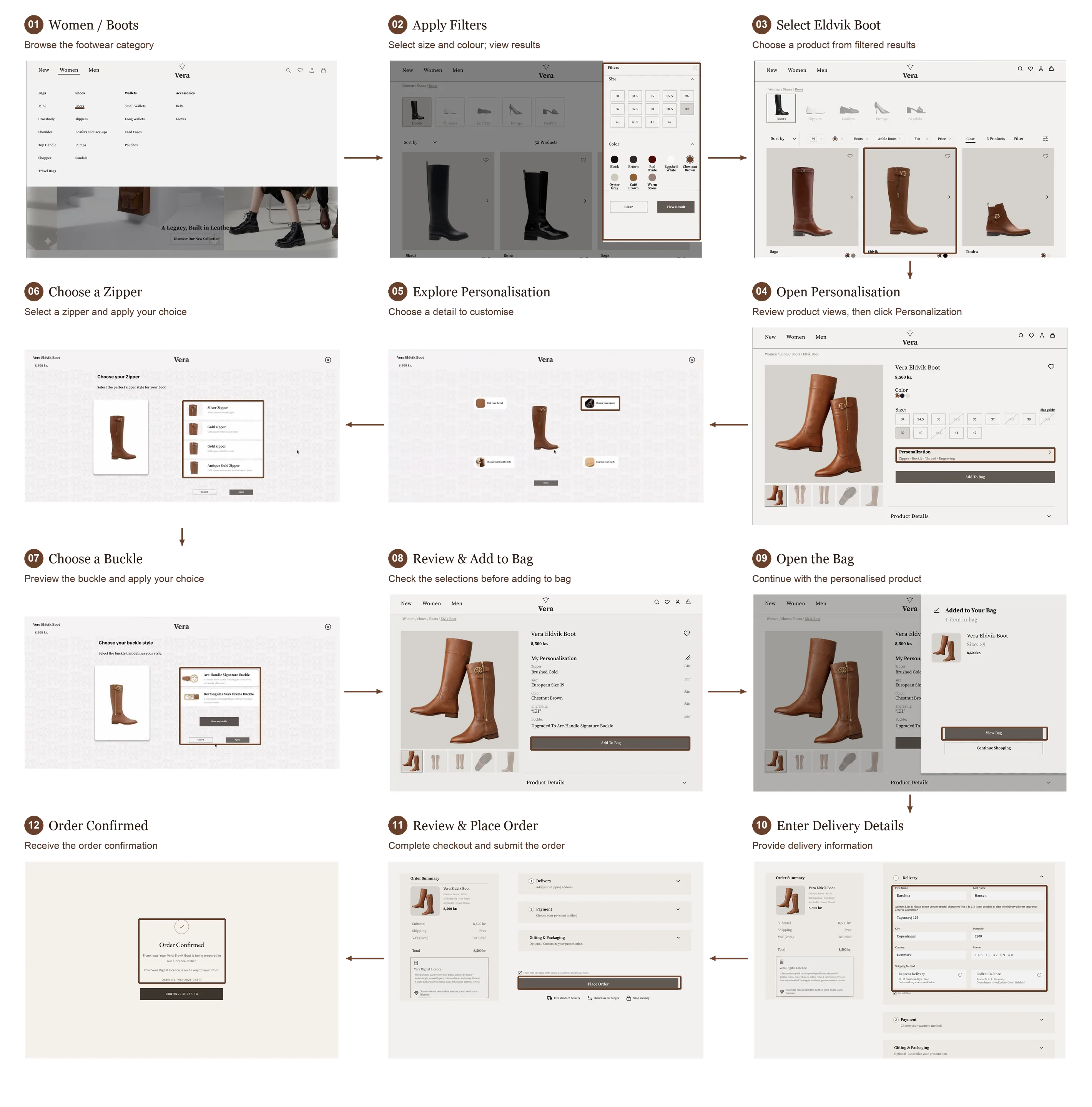
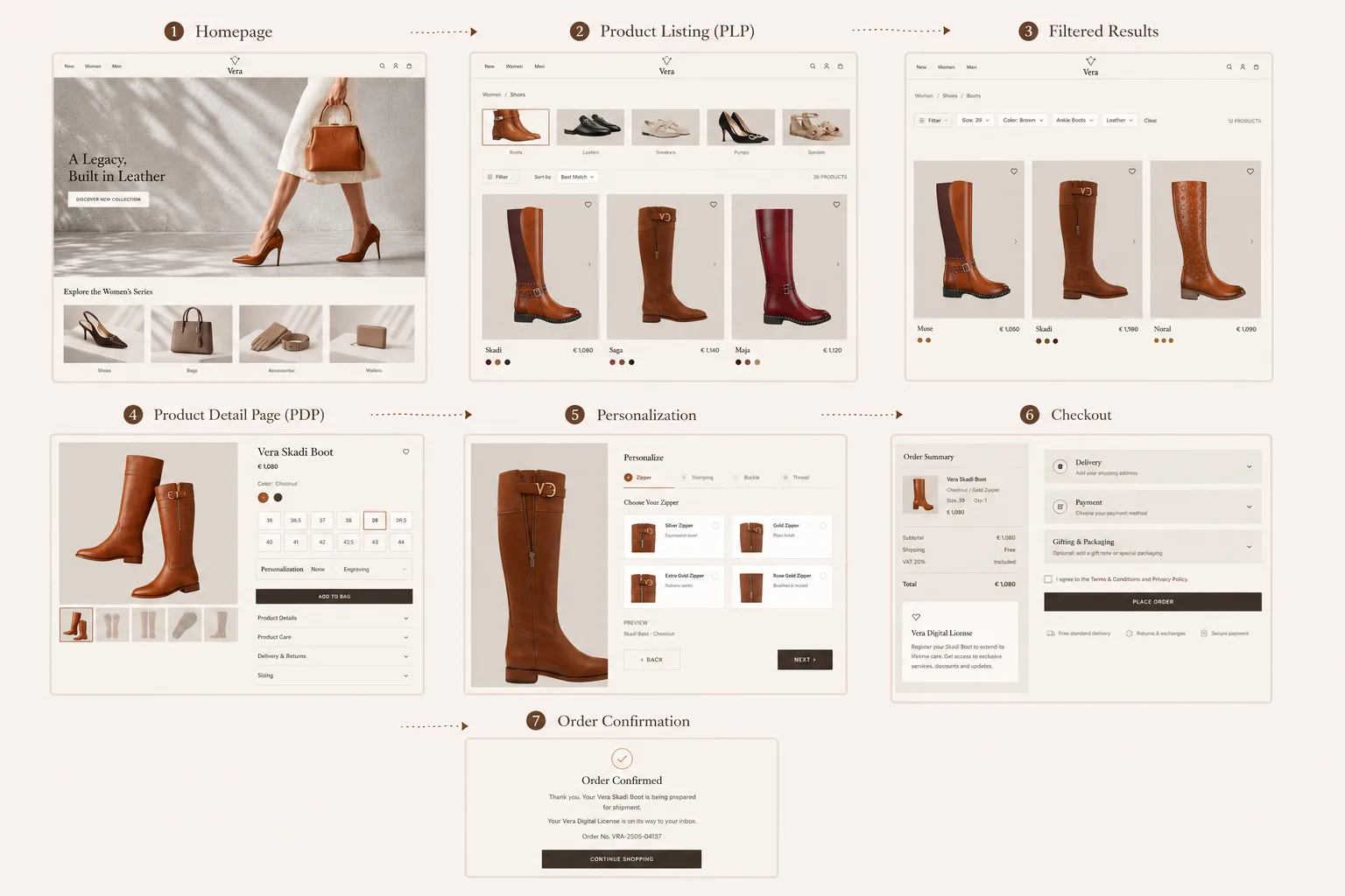
Based on my persona and scenario, I mapped the complete user flow for Kristina's journey — from her first landing on the Vera website through to a confirmed order. Each step was designed to reduce friction, build trust, and guide the user naturally toward a satisfying, personalised purchase.
I created Low-fidelity wireframes on Figma to map out page layouts design vision.
The wireframes went through a couple of rounds of iteration before the final content was developed.
My hand‑drawn sketches interpreted and refined by Gemini.
For designing high-fidelity interfaces, I defined a design system consisting of colors, fonts, and dimensions of elements that should be consistent on all screens.
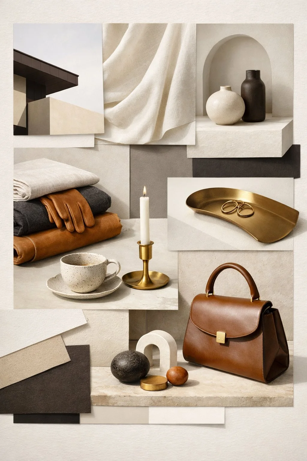
MoodBoard
Style Tile and Design System
Take a look at my final high-fidelity Designs, complete with colors and images!
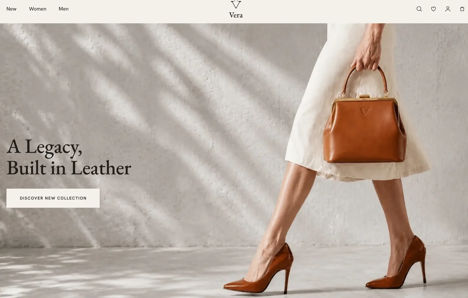
Home page
Boots page
Filtered boots page
Selected item page
Personalization page
Payment page
Confirmation page
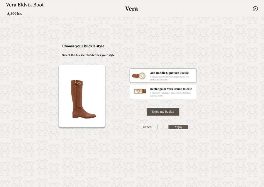
Using my ideation process, I explored two different homepage directions. After running usability tests and refining the concepts, the insights made the choice clear: users were consistently distracted by the moving imagery. Based on this feedback, Design 2 emerged as the strongest and most user‑focused direction, and it was selected for further development.
After multiple versions of sketches, I made 2 versions of the Hi-fi prototype and performed A/B testing. I then incorporated feedback and recommendations into my final prototype.
Task
Filter & add to cart
Description
Please find a pair of shoes within a budget of 8,900 DKK, in size 39, in Chestnut Brown, with a flat heel, and add them to your cart. The shoe type is up to you — it can be an ankle boot or a long boot.
Goal
To evaluate whether users can successfully locate and apply multiple filters (price, size, color, heel height, and category) to find a product that meets specific criteria, without guidance.
Success criteria
Task
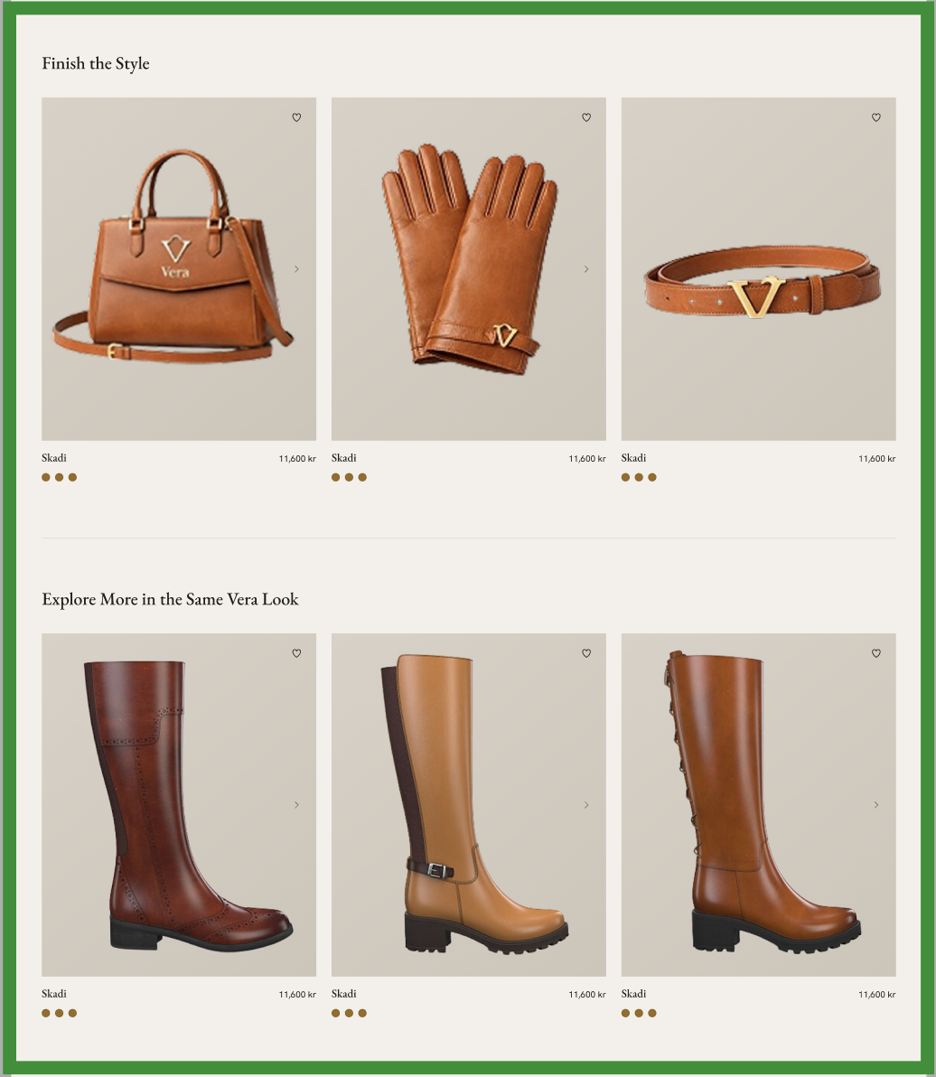
Find matching items
Description
Imagine you've just chosen a pair of boots. Try to find other Vera items that would match your chosen style, for example, accessories in the same color or material.
Goal
To test whether users can intuitively connect product pairing and discover the "Finish The Style" section as part of their shopping flow.
Success criteria
Task
Personalize a product
Description
After choosing an item you like, explore the page and see if you can personalize it, for example, by adding an engraving or selecting different hardware or thread options.
Goal
To evaluate whether users notice the personalization feature and understand how to use it to customize their product.
Success criteria
I tested my prototype on a total of 10 people.
I gave my participants 3 tasks.
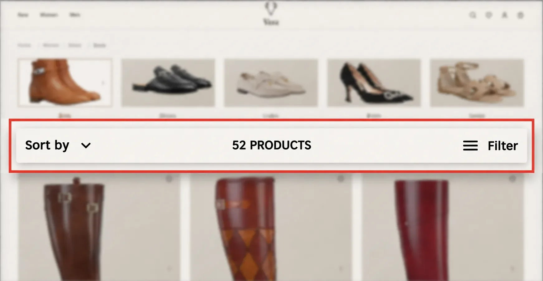
Before Usability
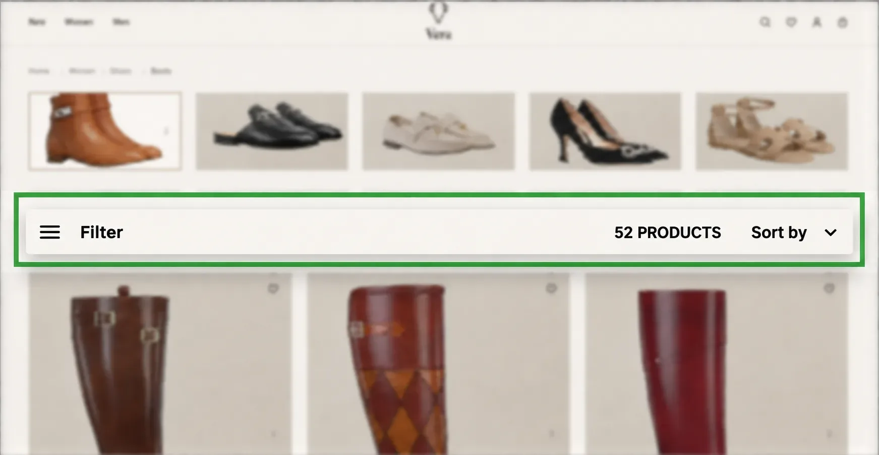
After Usability
| Observation | Impact | Design Decision |
|---|---|---|
| Users couldn’t find the filter easily | Filter placement caused friction | Moved filter to a more visible position |
| Once found, users used filters confidently | Logic and wording were clear | Kept structure, improved visibility |
| Observation | Outcome | Design Decision |
|---|---|---|
| Brand mission visible early | Info well‑structured | Smooth browsing flow |
Before Usability
After Usability
Before Usability
After Usability
Before Usability
After Usability
| Observation | Impact | Design Decision |
|---|---|---|
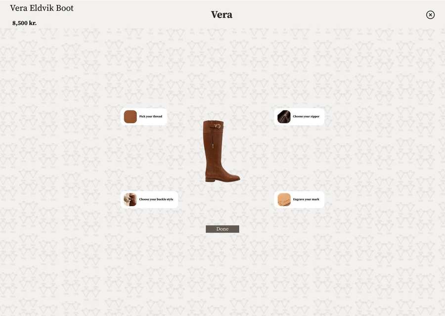
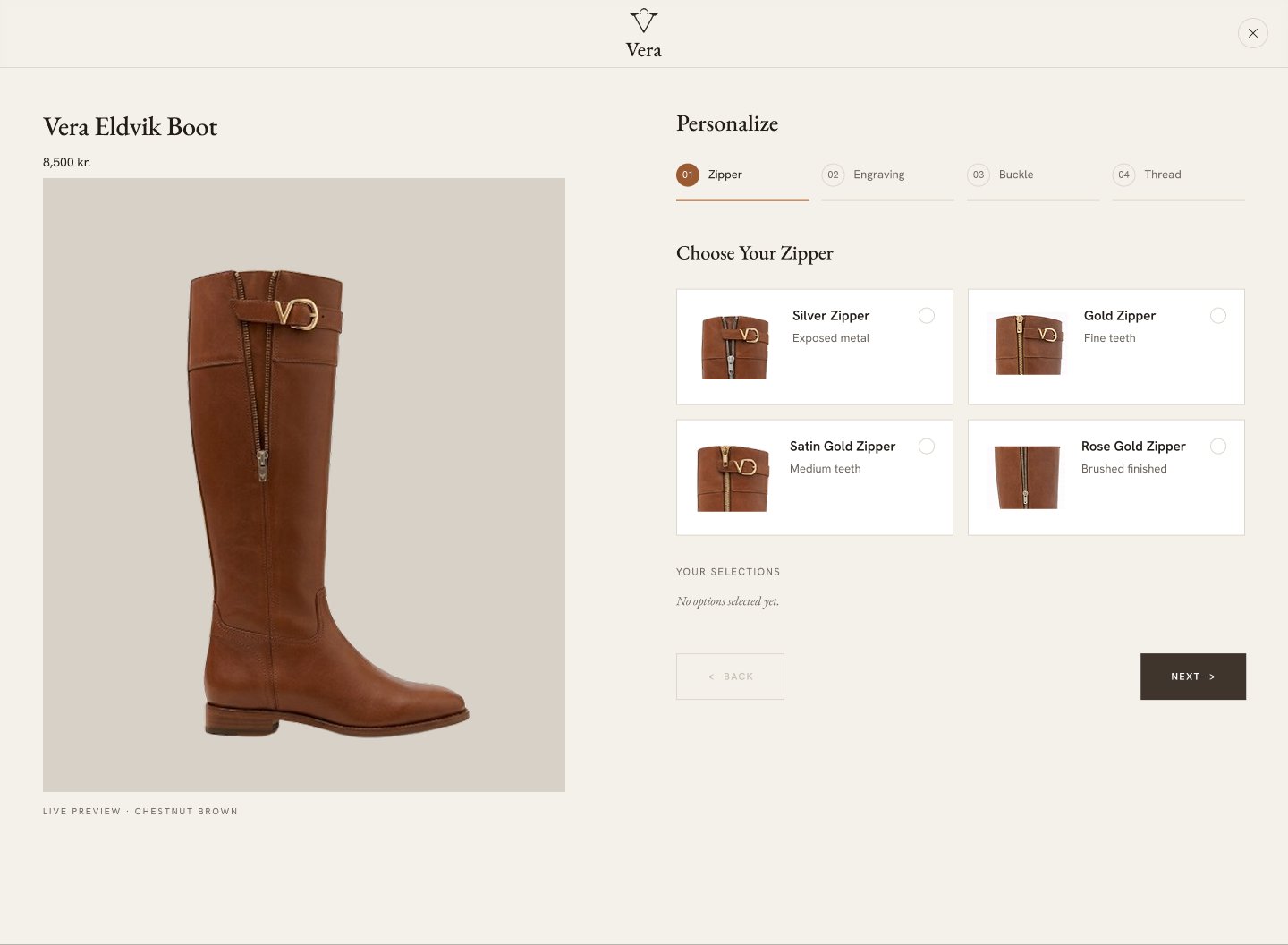
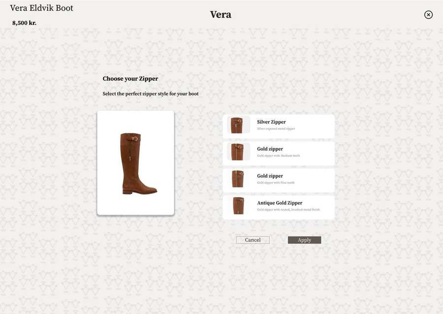
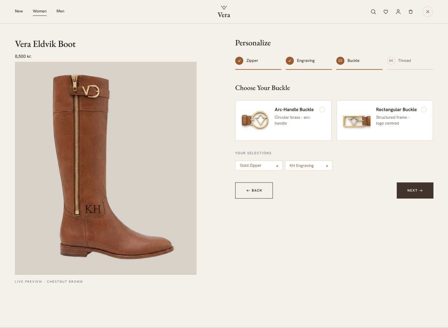
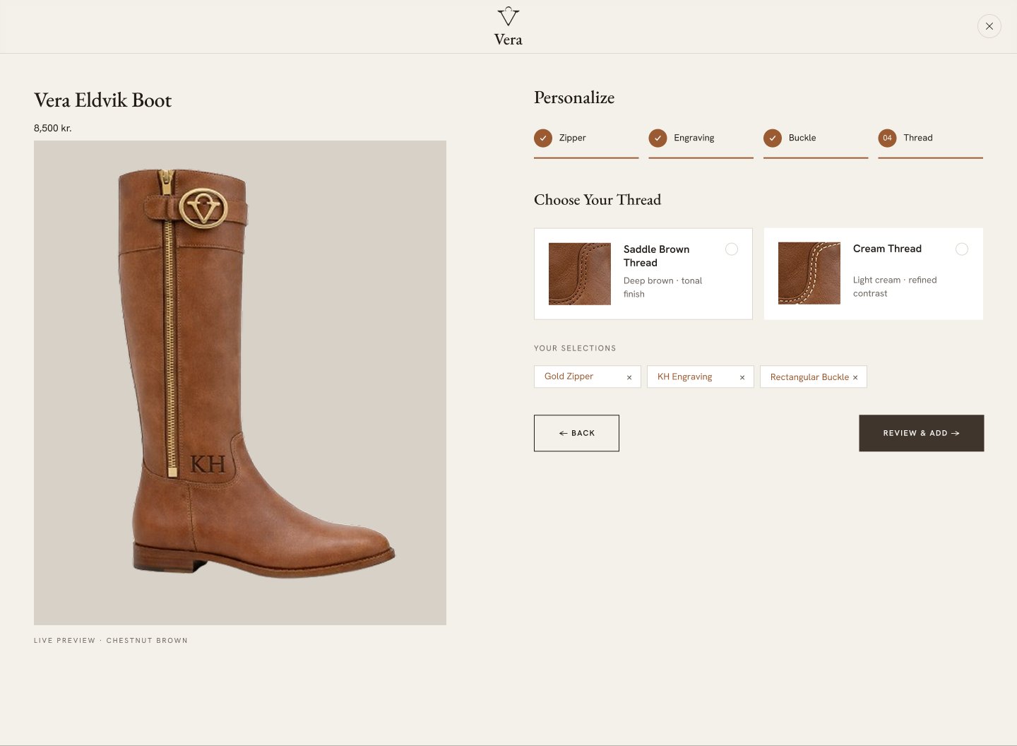
| Users felt overwhelmed by seeing all options at once and hesitated to start. | The personalization flow lacked structure and guidance, slowing decision‑making. | Introduced a step‑by‑step guided process to reduce cognitive load and help users move confidently. |
| Preview images were too small, making it hard to compare materials and engravings. | Users couldn’t evaluate details clearly, reducing trust and engagement. | Increased image size for clarity and better visual comparison. |
| “Apply” button caused confusion; users expected instant updates. | The extra click interrupted flow and made the interaction feel less intuitive. | Removed “Apply” button and implemented instant visual updates for seamless interaction. |
I am interested in ordering from this site because:
"With the first look at the home page, I got the luxury spirit."
— Participant 3
"That looks and feels like a real website, and I like the picture you chose. I'm really interested in buying."
— Participant 7
"The filtering was really easy once I found it. I could narrow down exactly what I wanted by size, colour, and heel height without any frustration."
— Participant 1
"The 'Finish The Style' section is such a nice touch. I immediately found accessories that matched my boots — it felt very curated and premium."
— Participant 5
"Website flow is smooth and clear, and I like it."
— Participant 9
"The step-by-step customization made it so easy. I didn't feel overwhelmed at all — each choice was clear and I could really picture the final product."
— Participant 6
In this section, you can check out the complete final prototype.
(Note: All images are sourced from Google, except the ones featuring the Vera logo.)
Designing this website from scratch taught me how important it is to stay connected to users' needs throughout the entire process. My first student project showed me that the best way to maintain this understanding is by documenting every research insight and returning to it continuously as the design evolves.
I also discovered that I genuinely enjoy interaction design — shaping how users move through a product and how each step feels. This is an area I'm excited to continue developing in future projects.
Moving forward, I want to focus on making the website more accessible, ensuring that every user regardless of ability can navigate the experience comfortably and confidently. Improving accessibility will make the product more inclusive and ultimately more user‑friendly.
Designing the "About Vera" section to communicate the brand story, values, craftsmanship, and mission in an engaging and trustworthy way. This would help users connect emotionally with the brand and understand what makes it unique.